Caper & berry
An independent catering company
Since 2001, English catering company Caper & Berry has been providing bespoke corporate events and elegant weddings for a portfolio of satisfied customers. They build their business on word of mouth, and engaged Keeping to enhance their brand exposure.
Project Deliverables
Consultancy
Brand Identity
Illustration
Photography
Print Collateral
Website Design


The Brief
Although familiar in the market, the Caper & Berry brand lacked a consistent digital presence. It was important for the client to retain the essence of what they had, but to improve the impact across multiple channels.
To achieve this we engaged Caper & Berry in an initial brand refresh, which we measured by engaging the various teams within the business in strategic Brand Workshops — ultimately surfacing the strengths and weaknesses of the existing brand touch points.


Our Approach
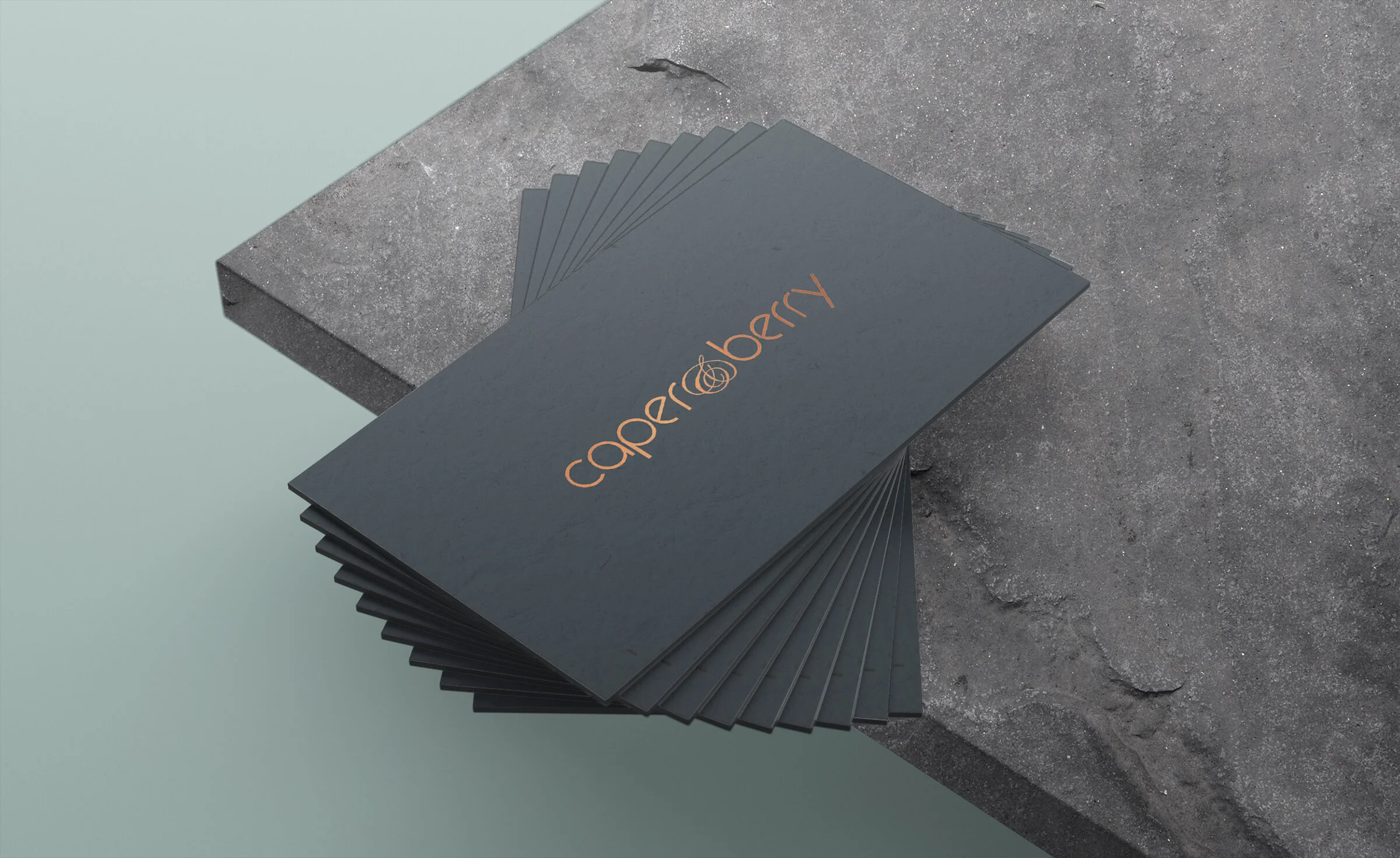
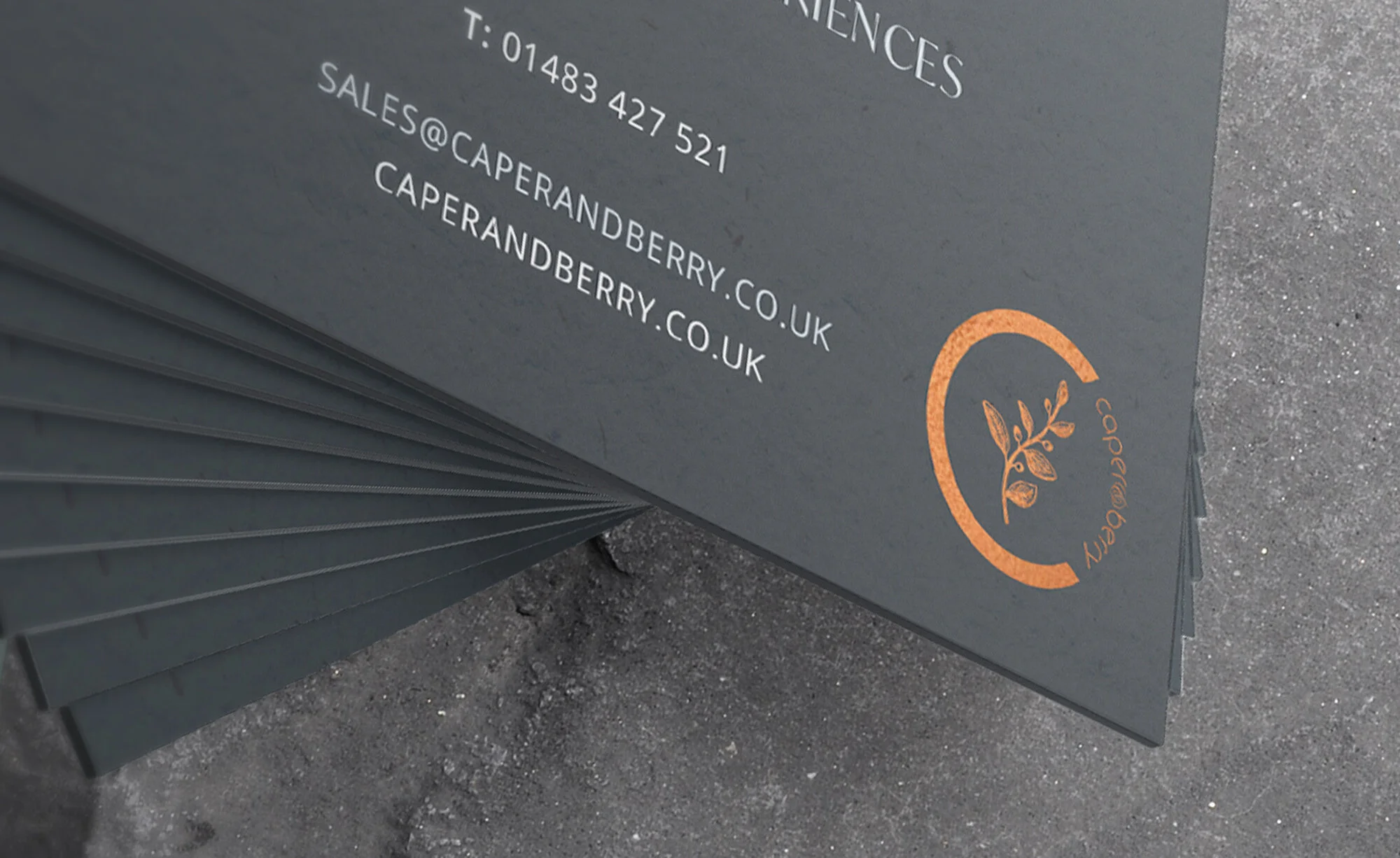
We worked closely with Caper & Berry at their headquarters just outside London, to form a brand strategy that had depth and resonance with how they work. This meant getting to know the team, tasting what they created and seeing them in action. Informed by this, we designed a digital mark for them based on a Caper tree.
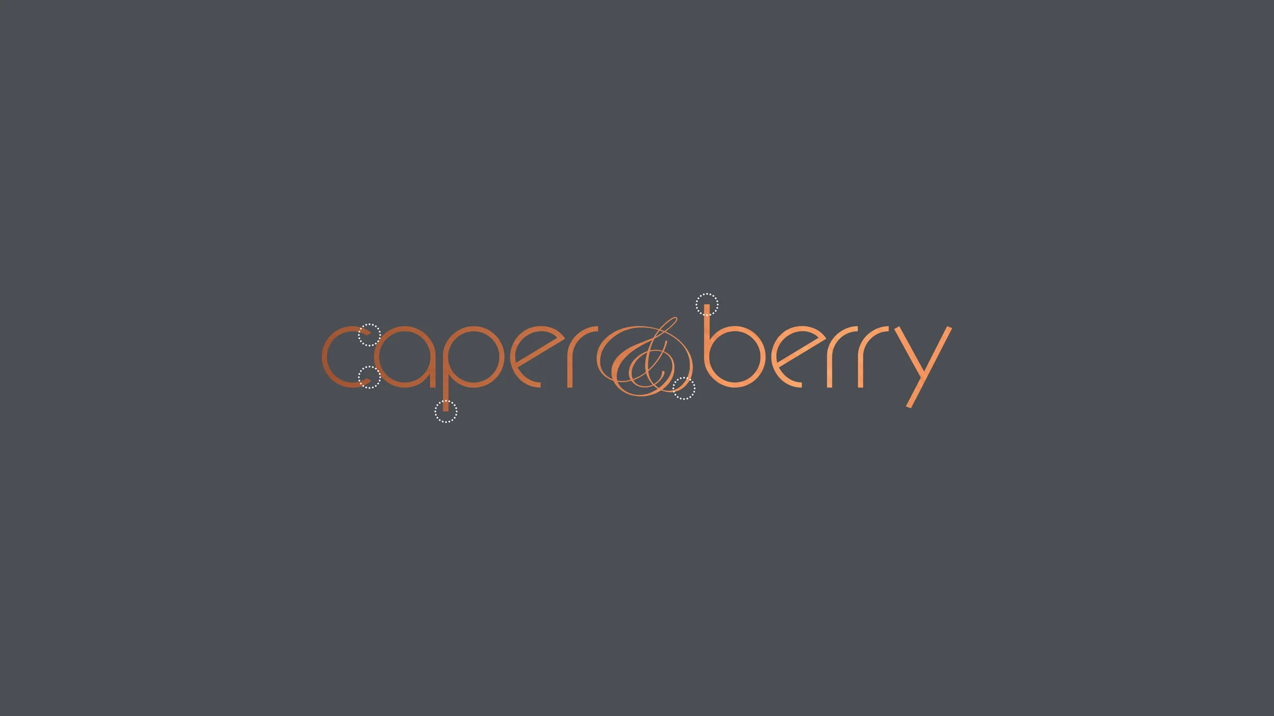
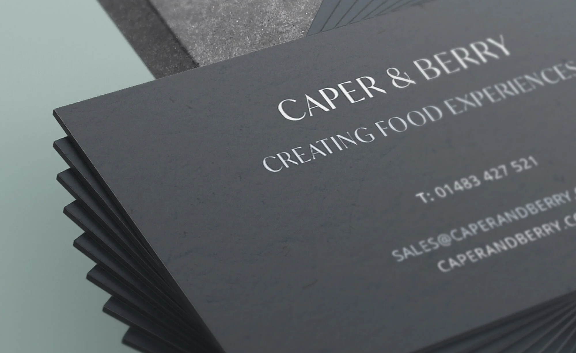
This illustrated mark connotes the same hand crafted and detailed work they produce. We also refined the typography of the original logo, reducing certain letters and kerning to improve readability.
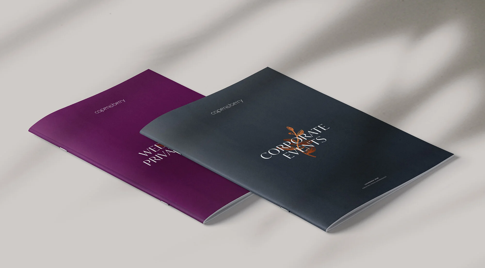
Further workshops with the client proposed the need to develop the brand’s colour palette. We introduced a distinct forest green for ‘Caper’ and rich purple for ‘Berry’, creating a harmonising natural scheme that oozes luxury, an important detail for the brand.


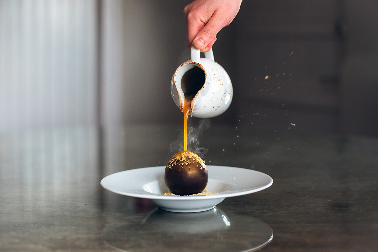
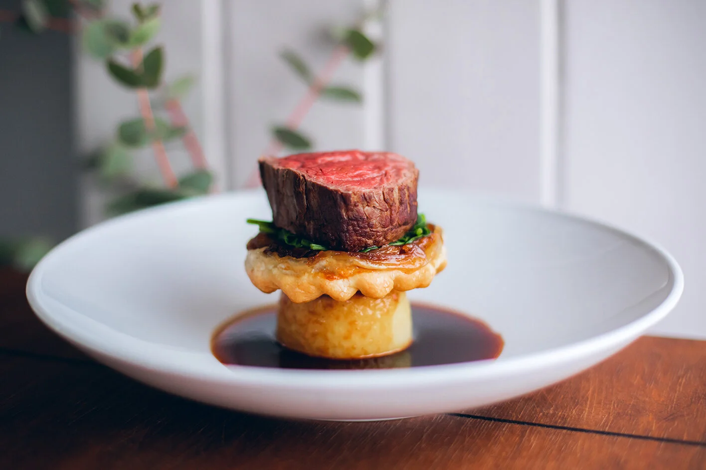
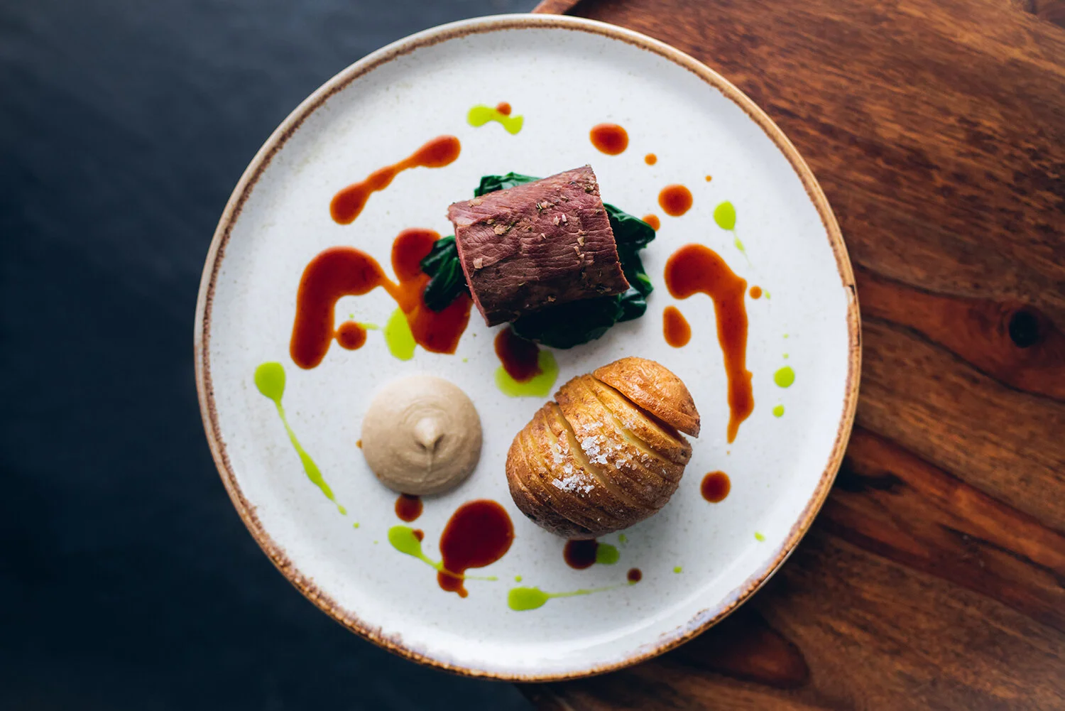
Capturing food experiences
Working with a carefully selected photographer, we perfectly captured the catering menu and ensured that the Creative Direction was inline with the updated branding.
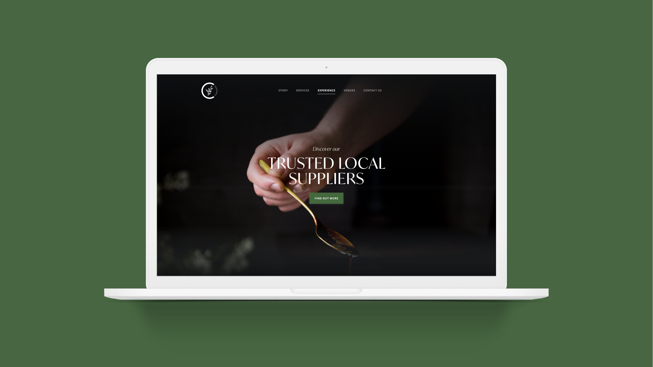
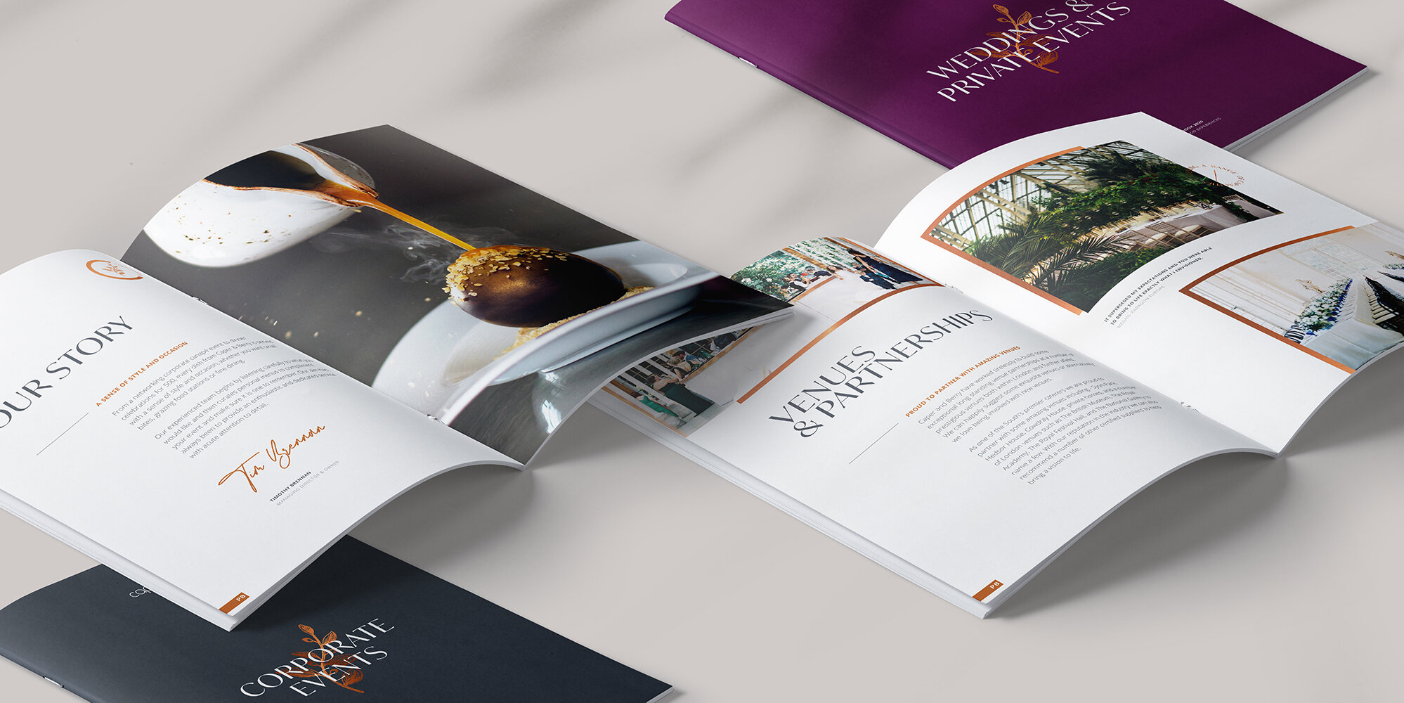
We delivered a bank of highly luxurious food photography, which we then used as a focus for the subsequent design work across an array of materials and customer experiences, including Caper & Berry’s website and brochures.

Vehicle Design
A garnish is an item or substance used as a decoration or embellishment accompanying a prepared food dish or drink.
We took this terminology and created a unique pattern which resembles a chef signing off their dish with a personal touch. This is resembled in an abstract form across the vans - all finished in metallic copper.

The Outcome
A cleaner and more legible logo now sits alongside a secondary mark, in a comprehensive set of guidelines for consistent application moving forwards.
The new colour palette for printed and digital materials has enabled the brand to be distinctive in the market, enhancing their existing popularity and reputation. Luxury flows from print to screen with a website that successfully places their catering at the core. It now provides an aesthetic platform to funnel social traffic to, emphasising the food and dining experience and, ultimately, leading to increased customer conversion.
Copper accents and clear san serif typography provide that added level of elegance and sophistication to the Caper & Berry brand.