Lumi
Technology at your finger tips
Lumi creates online and in-room experiences for shareholder and member meetings, legislative affairs and elections - among other events. Using innovative technology to evolve traditional annual general meetings, they make the voting process for their clients fully digital, streamlined and, above all, easy.
Project Deliverables
Website Design
Brand Identity
Consultancy
“They have evolved our brand without changing it, and the overall results are fantastic.”
The Brief
Lumi required a refreshed website, that made reaching and converting potential clients just as easy as their product made running events. This would involve a restructure, and some significant modernising - to make the user experience much more seamless.
We worked closely with the Lumi marketing team and partnering digital agency, BBD Boom, to form an improved structure to the user journey, making it easier for potential clients to see the information, the solutions and the technology most relevant to them.
Approach
It became clear to us that Lumi’s clients often fell into clear categories of requirements, and that funnelling them in to their niche early on would enable a more tailored experience to be delivered. Collaborating closely with the team on the architecture of their content, we set out the best possible map for the user to get to the information they needed - with the goal of converting them as soon as possible. This meant ensuring clear choices were presented to the user at the right moments and that the abundance of resources that Lumi offers were streamlined. All of this was assisted by making the most of the many USPs that Lumi offers.
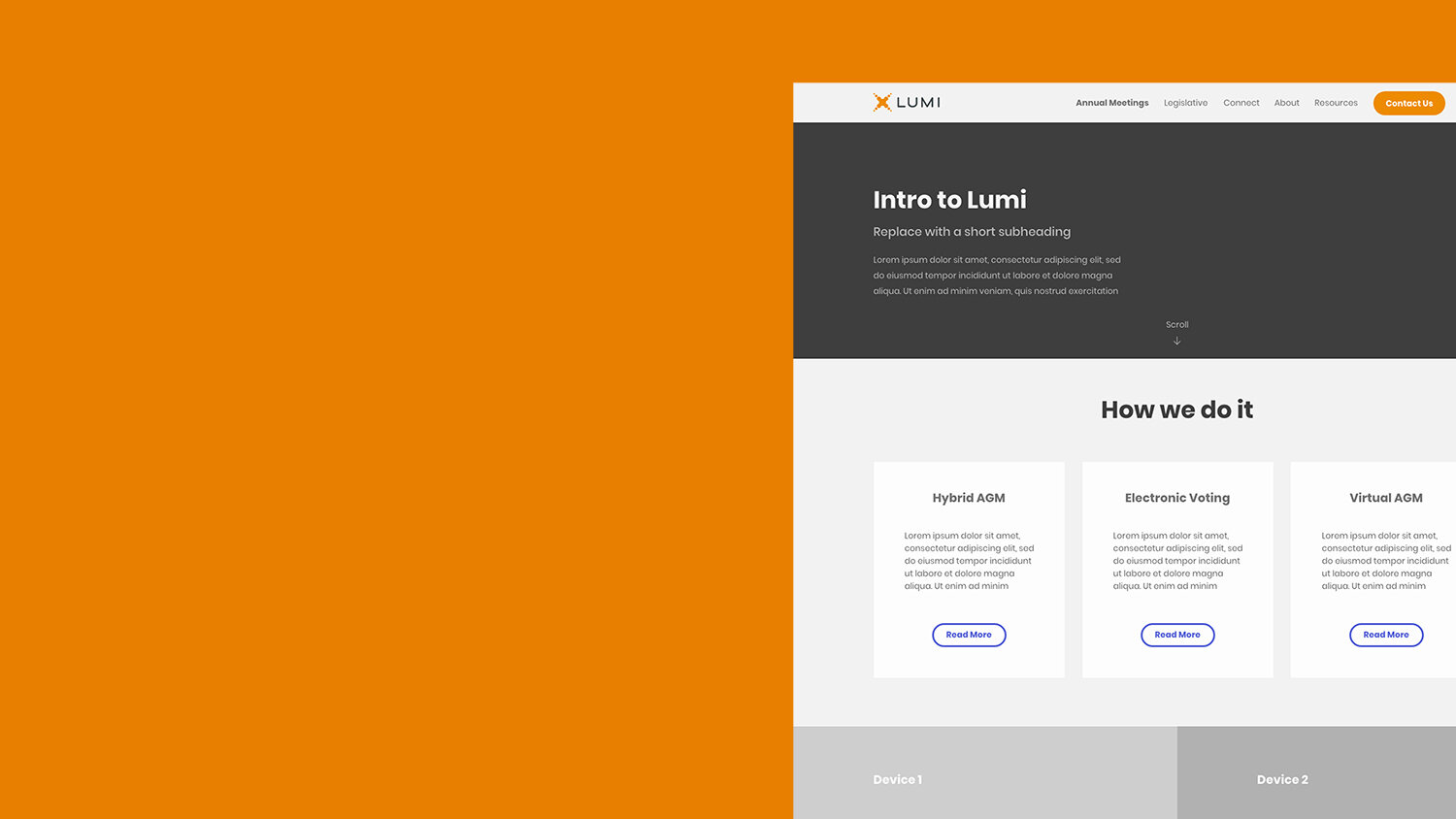
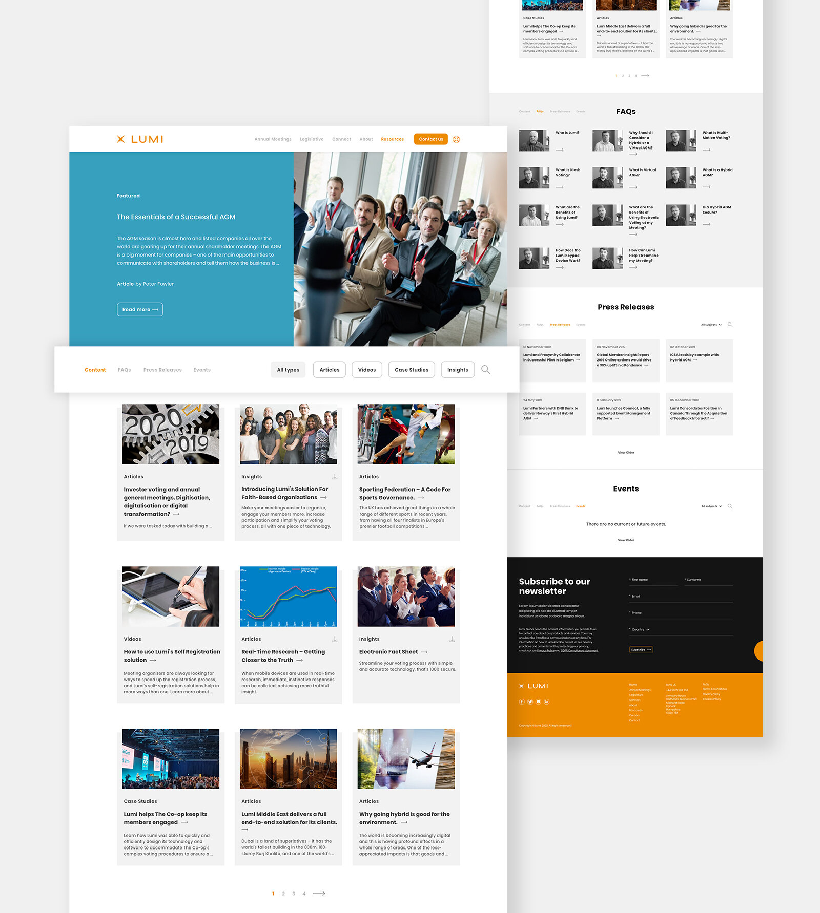
Extensive wireframes helped us focus the flow of information from the homepage, to specific landing pages about services and technologies. The wireframes also allowed us to think about the needs and requirements of their global customer base, ensuring that differing content would be facilitated in every way possible, whilst questioning what requires the most prominence and how certain information could be displayed differently.
Outcome
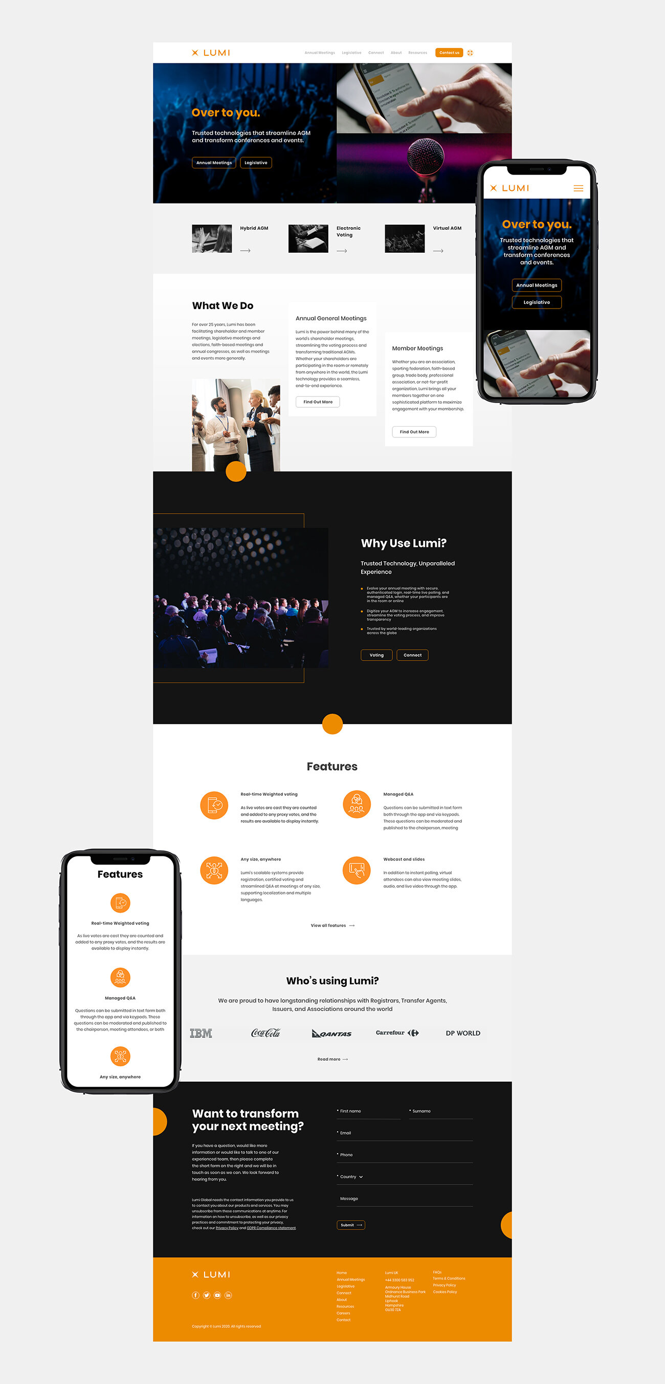
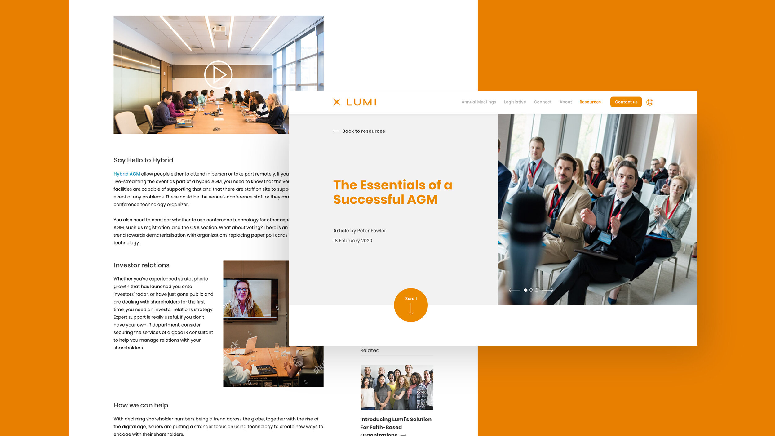
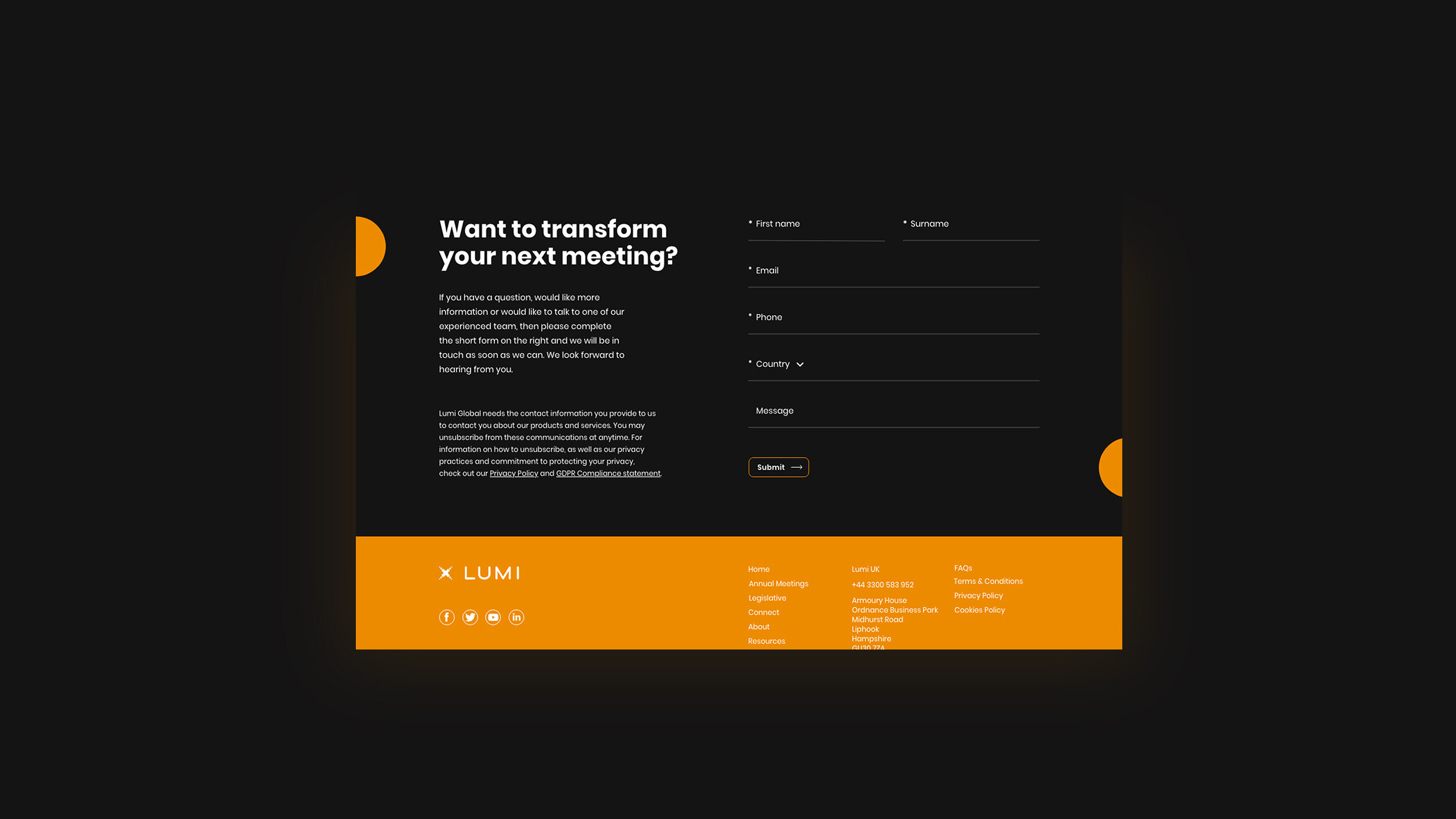
We began designing the website with simplicity in mind, using Lumi’s distinctive orange as the feature colour for buttons, hover states and important features. This was done against an otherwise muted, monochromatic palette and meant that the key user journey became clear and engaging. We developed a design system which consistently utilised arrows, highlights and interaction animations, to enhance the user experience and funnel potential clients to get in touch through a natural consumption of Lumi’s content.
“The team really listened to the brief and came back with something that not only did what we asked, but pushed us to be a bit braver with our design.”
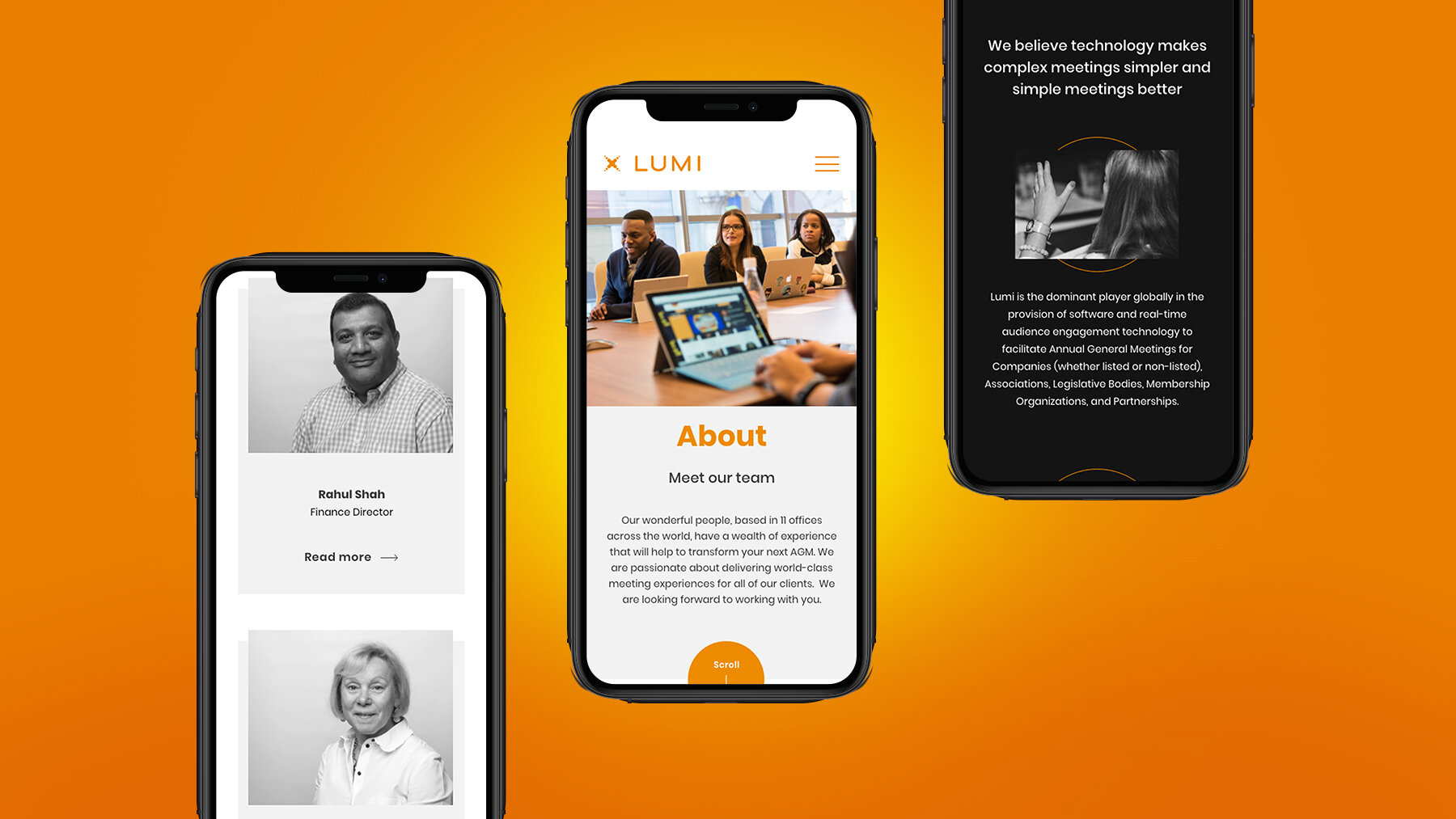
Consistency across all devices
Throughout the entire process, optimising the website for mobile was made a priority; making sure elements easily scaled for smaller devices, and that all content was easily accessible. The consistency across the website’s design from calls to action, to subtle animations and separating information into logical digestible sections, Lumi’s brand now shines through as a modern and digital authority in their industry.
“We were delighted with the end product and the service we received, as was our client. I would not hesitate in recommending or using Keeping Studio again.”


