Bubbl Portal
A new platform for geomarketing
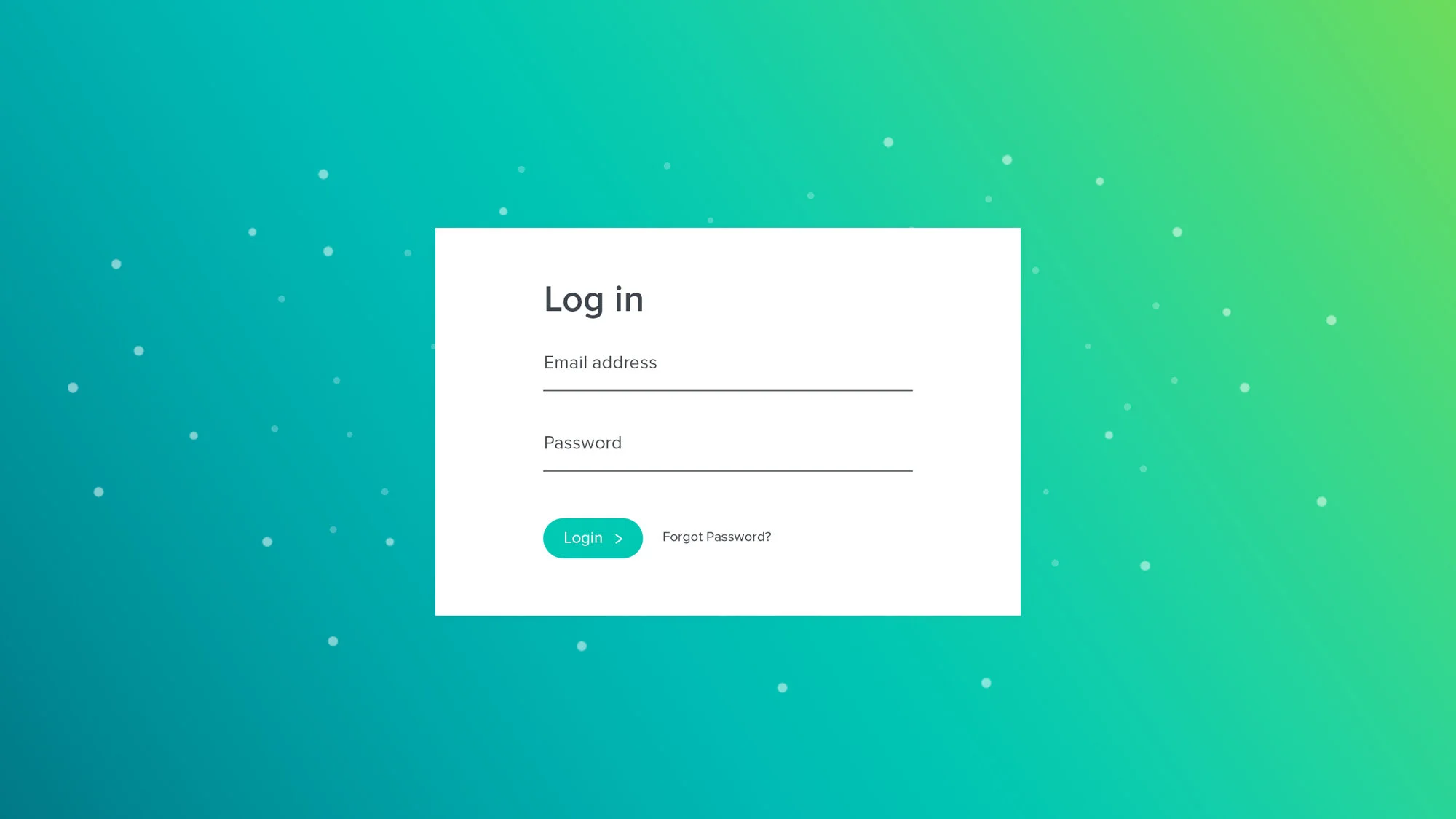
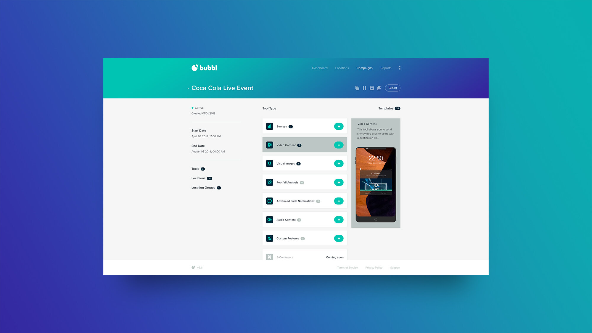
Following the successful creation of Bubbl’s new brand and website, Keeping was engaged to design their customer portal — with over 50 layouts to consider.
Project Deliverables
Consultancy
Website Design
UX Design
A consistent approach
The depth of Bubbl’s platform, both in terms of number of features and user rights, created a design challenge. We needed to ensure that a user would understand where they are, and what they can do, with simple design cues.
Using Bubbl’s dynamic colour palette — created previously in the brand design work we completed together — we sought to establish clear themes that would quickly become associated with certain workloads.
Essential discovery
With all projects, and especially complex digital builds, it’s key to not skip the important discovery phases of work. These phases create the fundamental building blocks that ensure the design considers its purpose.
With Bubbl, we took the opportunities to ensure we broke down every layer of the platform and every feature within. A clear map of contents was married with a supplementary report that outlined our technical and design assumptions.
Wireframes and beyond
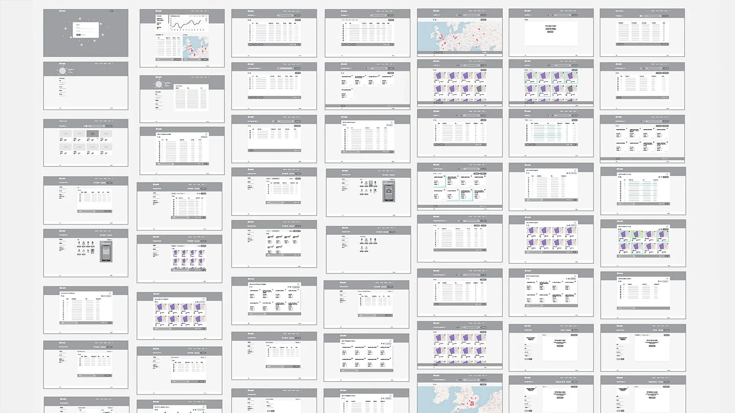
The understanding that was established during the discovery phase of work allowed us to create a comprehensive selection of over 50 wireframes — each outlining the content structure and navigational integrity of the key sections of the platform.
These wireframes were the centre of rounds of iterations and refinement, before forming the foundations for the high fidelity concept designs and prototypes that followed.
Keeping produced a full handover of working prototypes and development resources, for handover to Bubbl’s chosen development team.


