Nextbase
The UK’s most popular dash cam
Nextbase produces award winning dash cams and car technology for vehicles, with varying features. Their market-leading range has helped them to become the UK's best-selling dash cams in a rapidly growing market.
Project Deliverables
Website Design
The Challenge
Nextbase's old website was built on an antiquated system and needed modernising. The new website needed to do several things: have seamless eCommerce capabilities, house member login functionality, include the ability to upload dash cam footage, and compare products visually. These multifaceted elements required careful planning and designing to execute effectively.
The new website needed to be built on Umbraco. An Umbraco partner, Carbon 6 Digital (C6D), pulled Keeping into the project as design specialists. It was our task to overhaul the user journey - taking into account all new and existing website feature - to deliver a slick and streamlined customer experience. To do this, we collaborated with C6D and Nextbase to create an information architecture, extensively mapping out user journeys and touch points. This allowed the team to design wireframes with these journeys in focus, and develop a cohesive design system.
Responsive Website Design
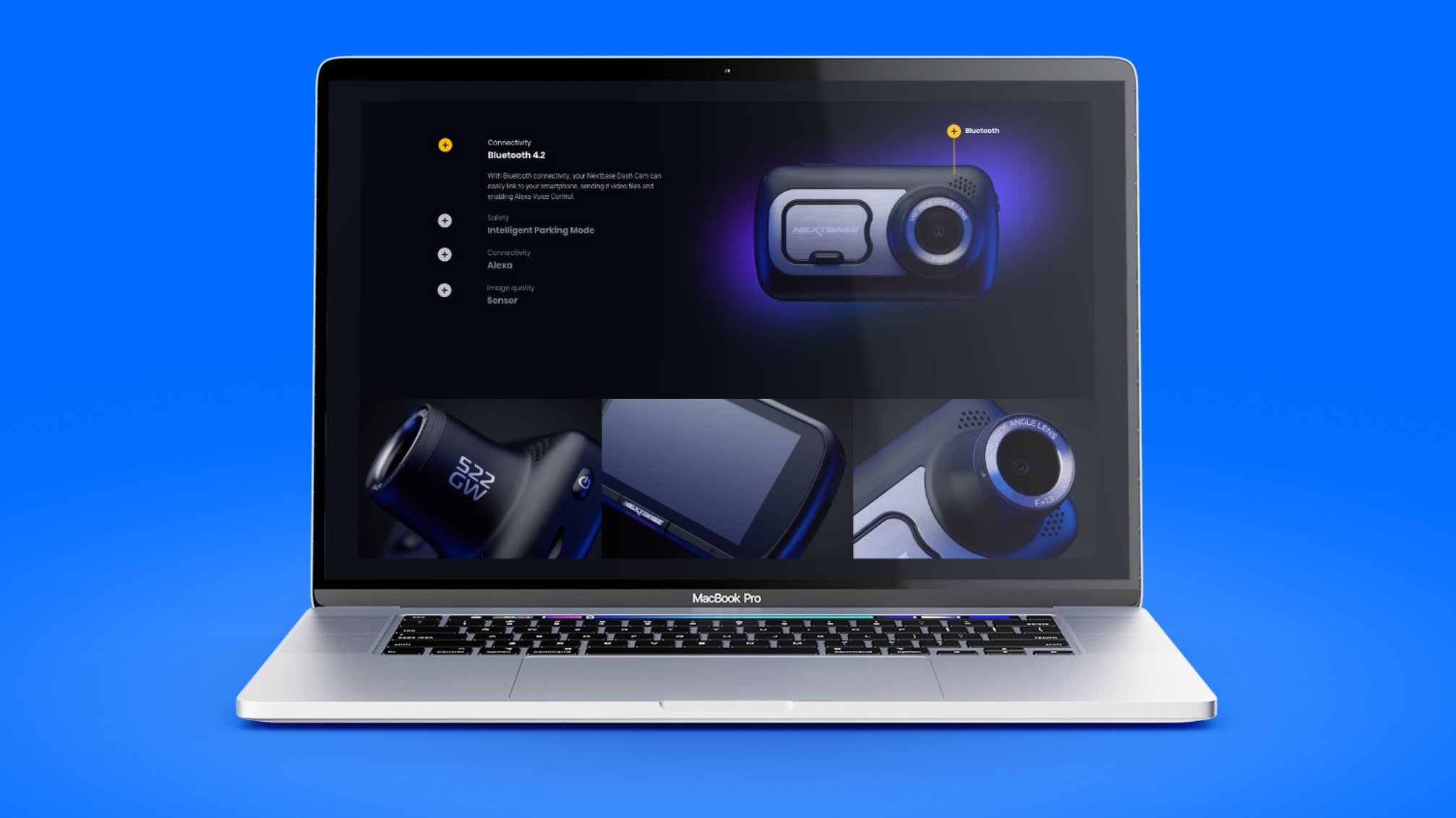
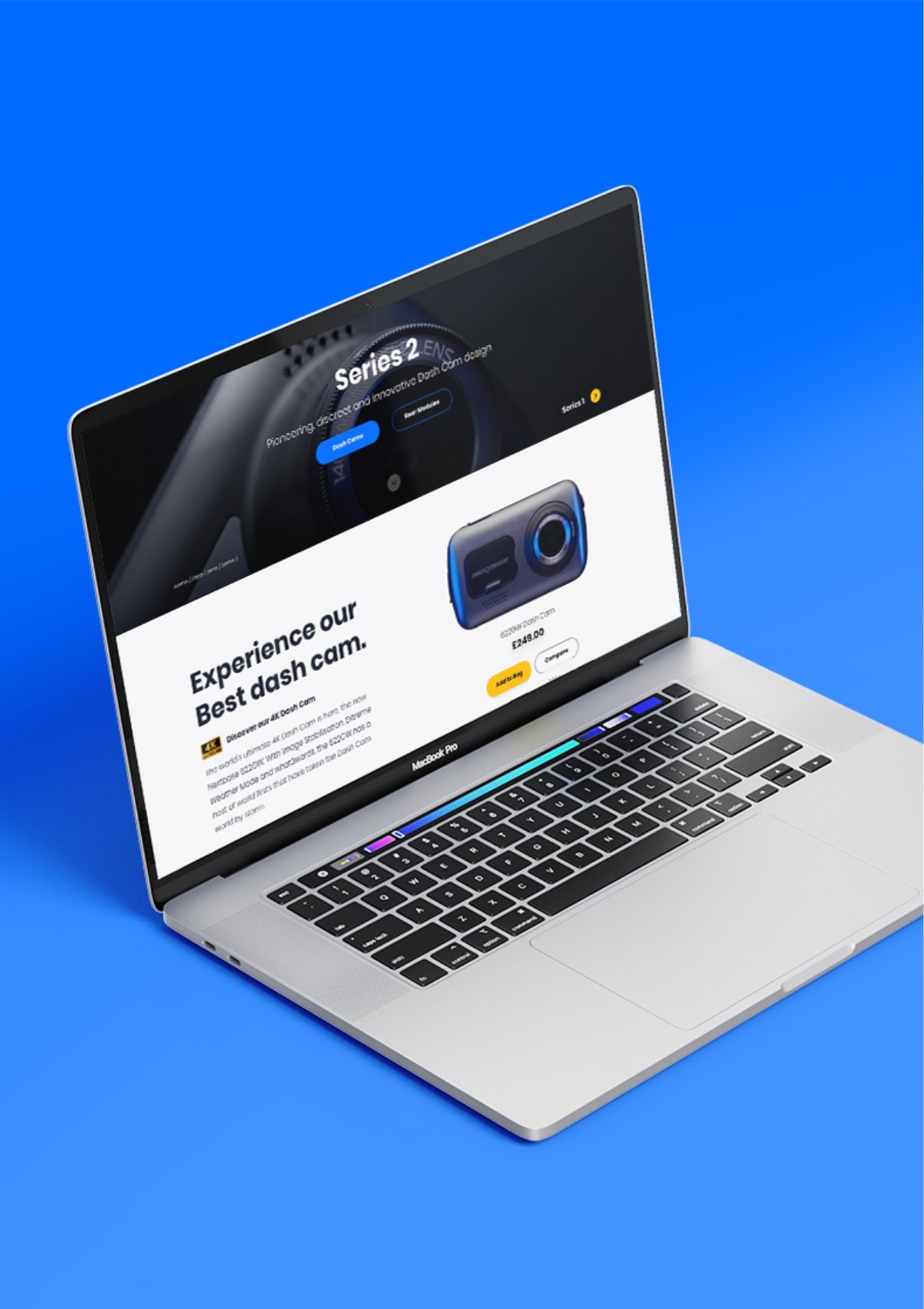
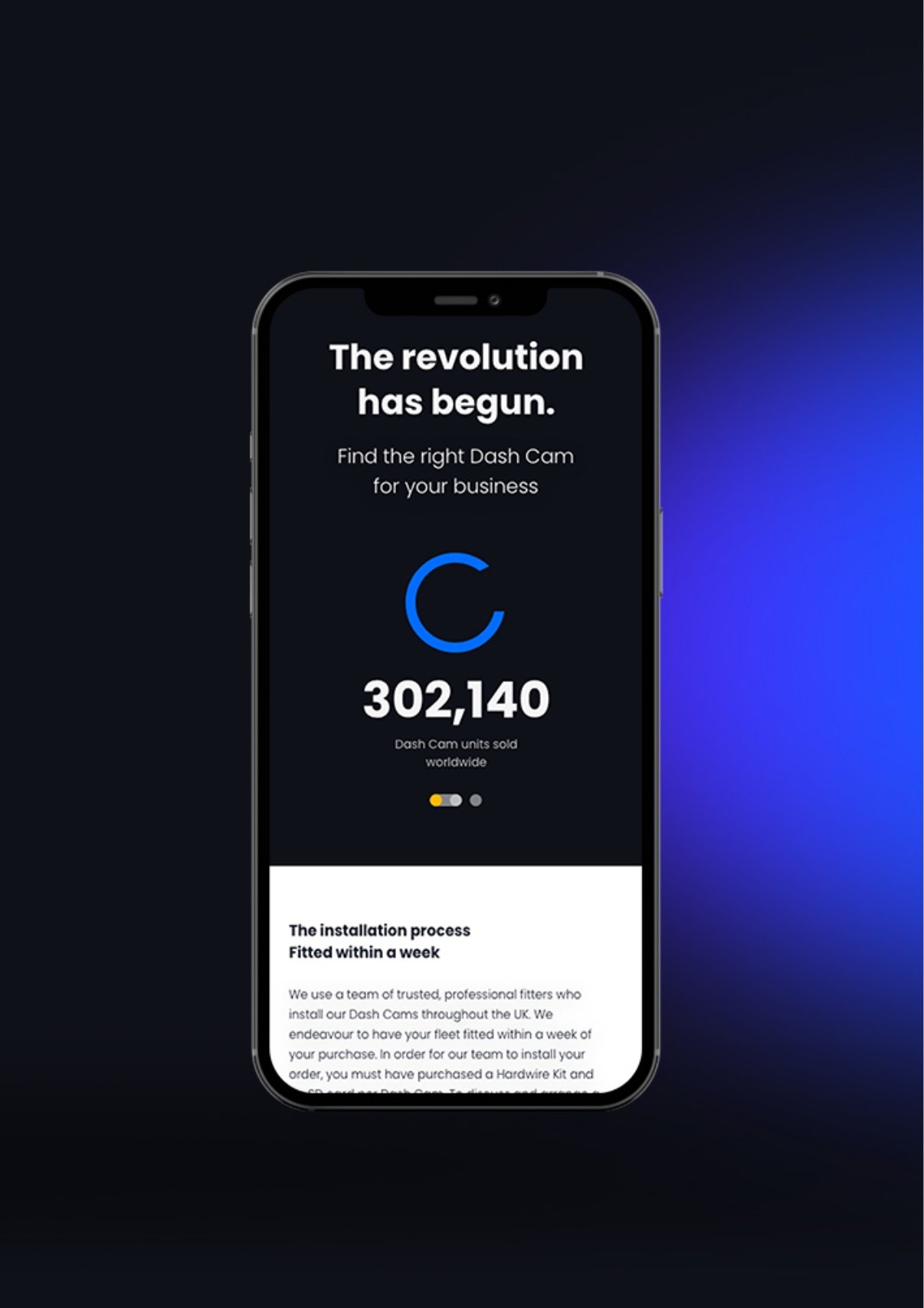
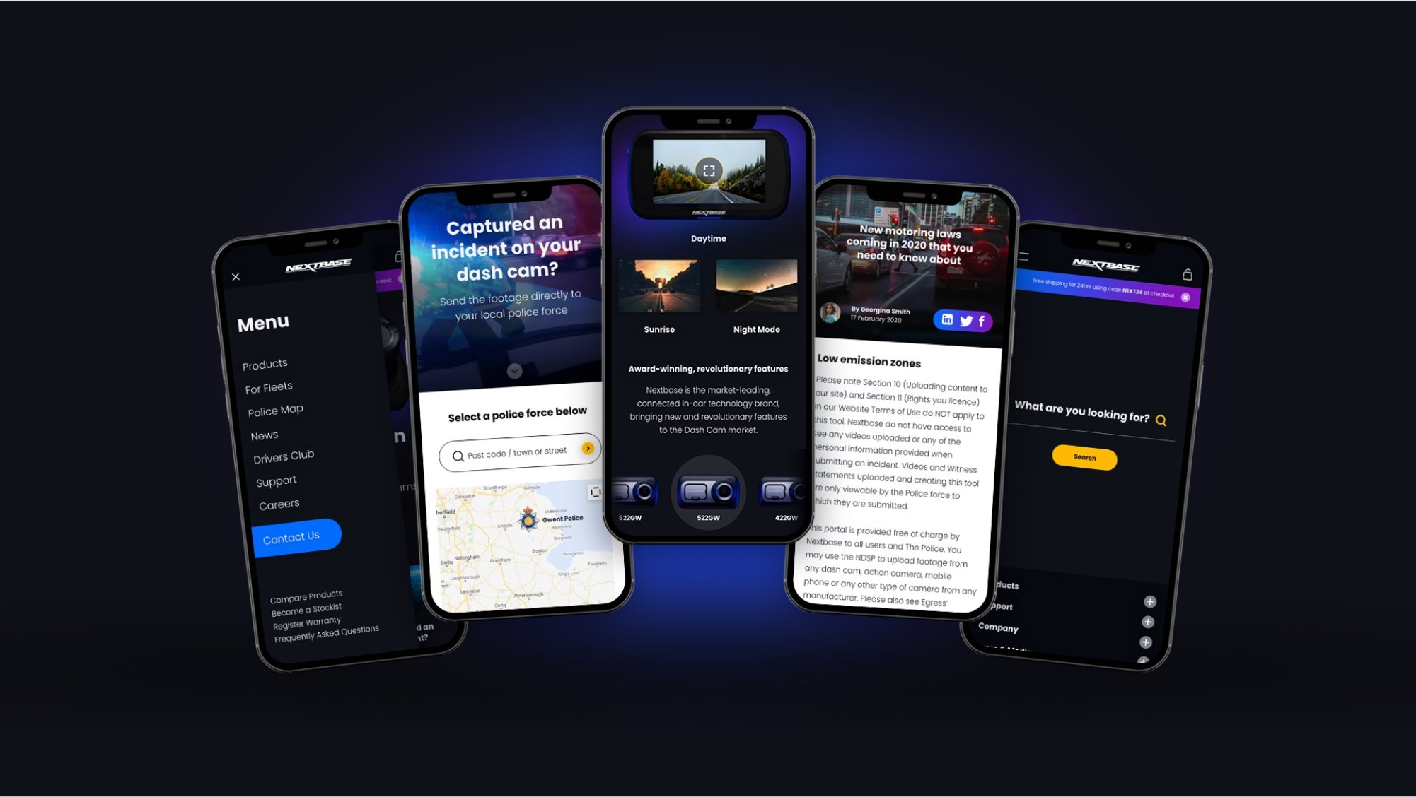
We designed the website with responsiveness in mind. Like the majority of online traffic, Nextbase's users were viewing the website on mobile. We understood that each customer journey had to work and look good, no matter the format. Breaking down interactive features like 3D dash cam renderings, feature comparison tables and the large support hubs for the different models, allowed us to create a number of consistent design templates.
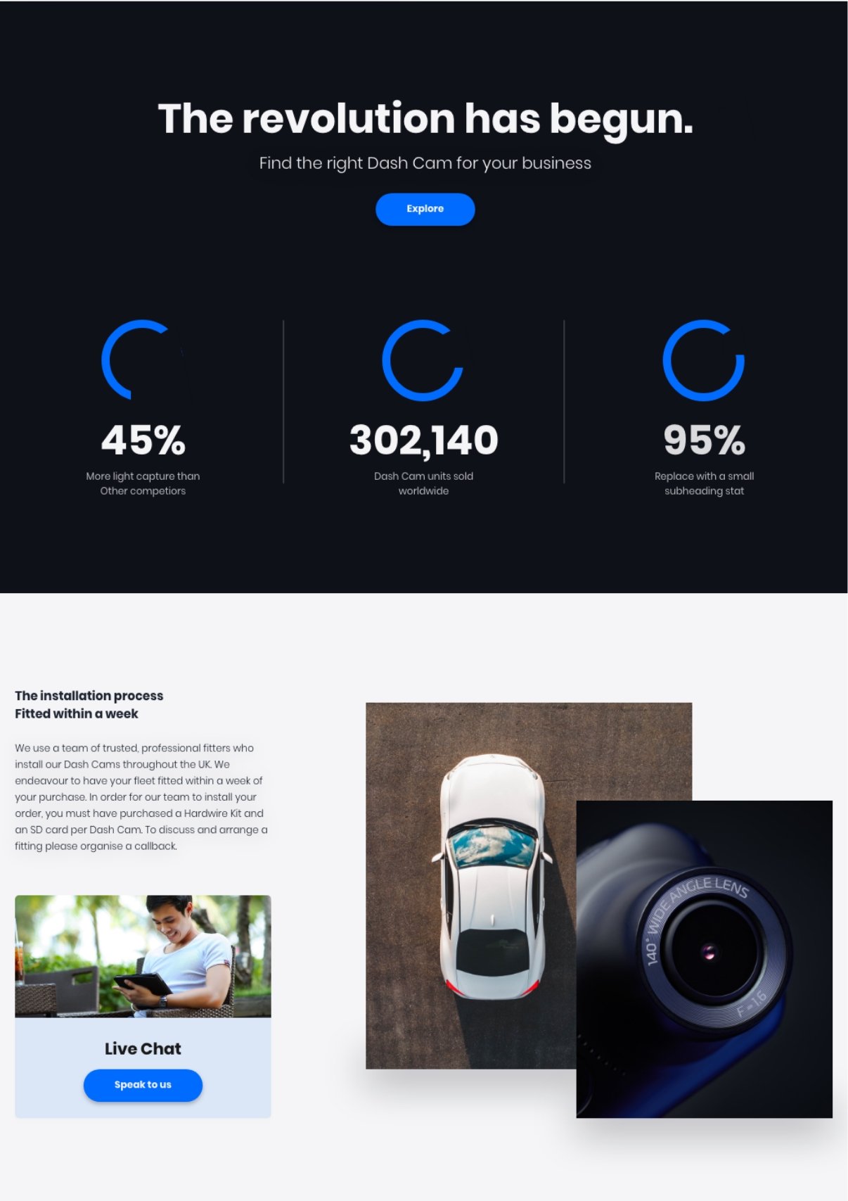
The use of a darker colour palette allows the promotional photography to shine. Utilising white space, being intentional with saturated colour and gradients, really drives the user experience by encouraging them to browse, navigate, and checkout.
Very impressed with Keeping Studio. They provided an amazing web design and were really helpful throughout the whole process, would highly recommend.
Nextbase Team
Other visual elements like iconography were also created, and these add to the evolved design system and branding. These new assets allowed Carbon 6 Digital to build the website with a clear visual language, while accommodating for future iterations.
What was achieved?
The Nextbase website now has a modern showcase of their products and technology, underpinned with key messaging, clear navigation and dynamic comparison tables for products. This allows potential customers to really get to grips with Nextbase's offering and unique features, all the while having the ability to make an informed purchase without leaving the flagship website. This is evident in the 50% increase on their previous best week's sales in the first month going live, without a sale or specific marketing activity.


