
Pret A Manger
Pret Perks App Animation
Track, pop, reveal, unlock - Pret A Manager came to Keeping to design the look and animation of the components in their new loyalty programme, Pret Perks. A mobile app and web experience intended to delight loyal customers with perks. The tracking and anticipation of the perks had to be engaging and enjoyable: part of the incentive itself.
Project Deliverables
UI/UX
Animation
Gamification


In the beginning
Keeping joined the Pret A Manger team when the business had defined the programme's mission statement and the mechanics of how it should work. Once a customer has signed up to the programme, they scan their unique QR code when they make an in-shop or online transaction. Once they've earned enough, they unlock a perk. Unlike other loyalty retail programmes, Pret didn't want a generic 'collect 9 stamps and get your 10th free' scenario. That's where our expertise came to the forefront.
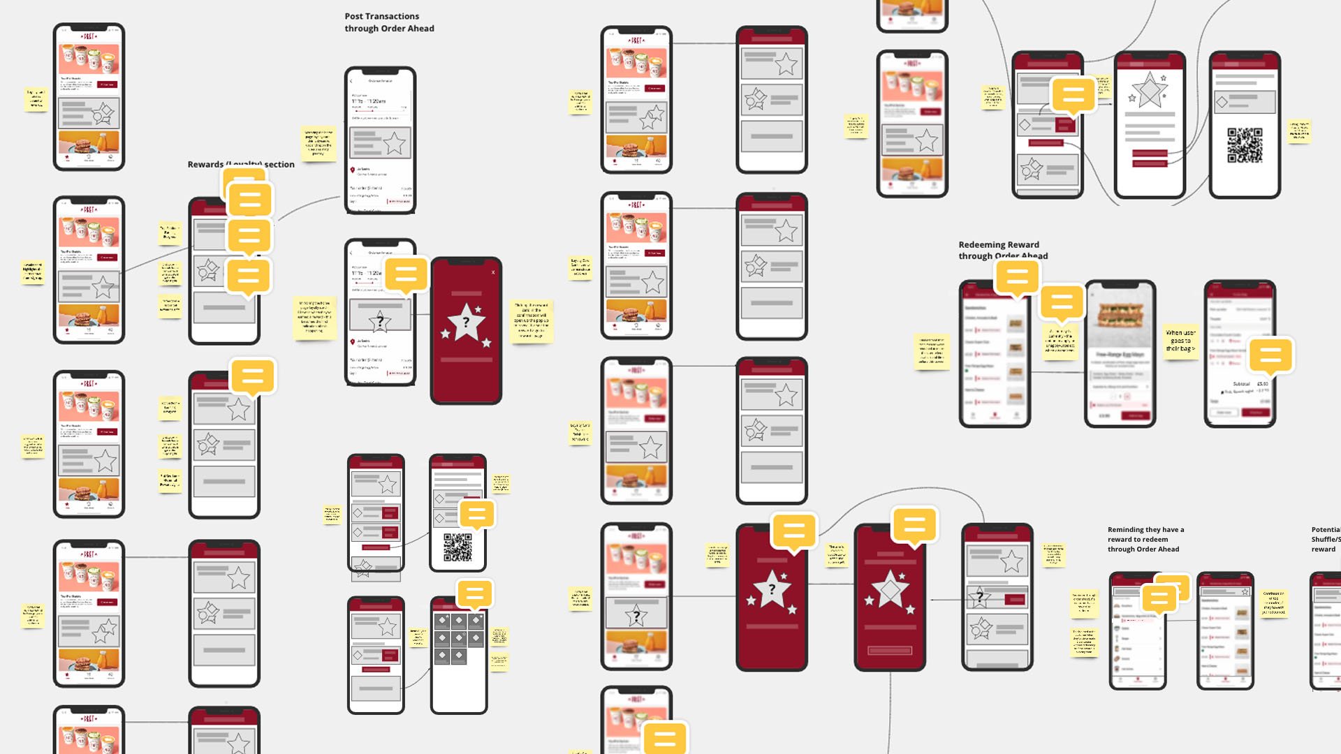
Collaborating with the business stakeholders, in-house marketing, design and development teams, we worked to map out the user journeys in a set of tested design sprints that covered different engagement channels and customer scenarios. Our key focus was defining where animations would add the sense of delight to the moment, and uncover ways to add gamification to the experience.

Exploration and Early Development
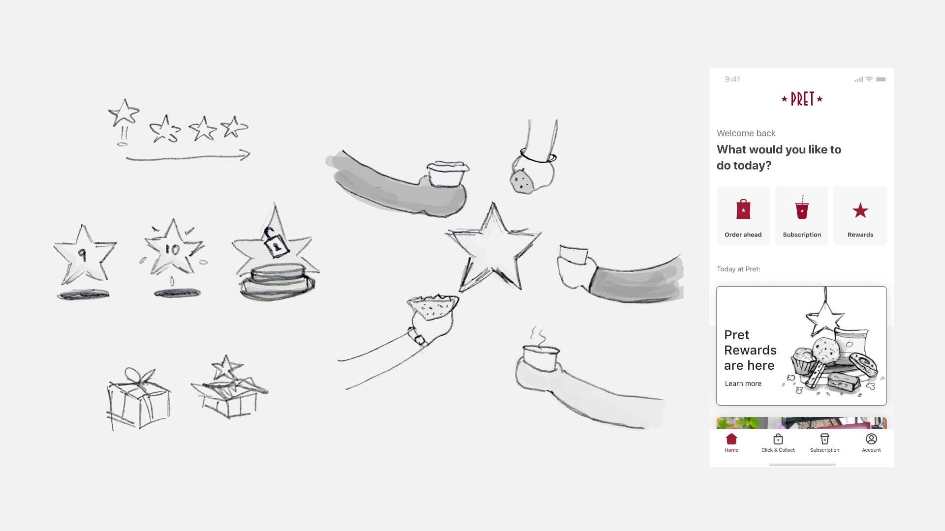
Visual exploration led to the decision to show the journey through the iconic Pret star, and track the user's journey from 0 to 10 stars; with a big reveal at the end.


Our creative work visualised how the tracker could animate into the final reveal, work in different states, and represent the Pret brand and tone of voice, but without working within strict guidelines for their online presence. This allowed an extensive feedback loop to begin, to demonstrate not only the progression of the tracker and perk reward journey, but a visual identity for Pret that didn't exist before the programme.


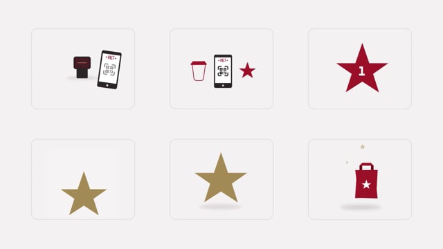
Tracking Stars/Journey
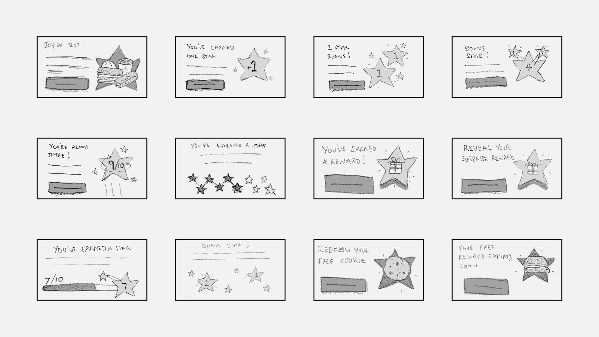
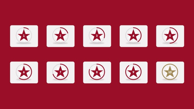
Further into the project, the direction was chosen. A loading circle which fills to a percentage that represents an amount of progress that is divisible by 10. This tested well with users as it was easy to understand and their progress was clear from a glance. It also moved away from cliche imagery like stamps, or having to use important retail space to show the amount of stars in the component.

Alongside the perk element, the tracker went through several iterations before a final version was decided by the wider team, focusing on the red star and loading bar. During the testing process the requirement that multiple animations on the same star number might be required - depending on the scenario or journey the user has taken to view it, or where it sits within the app or the website - was also tackled.
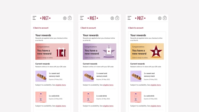
The Perks/Rewards
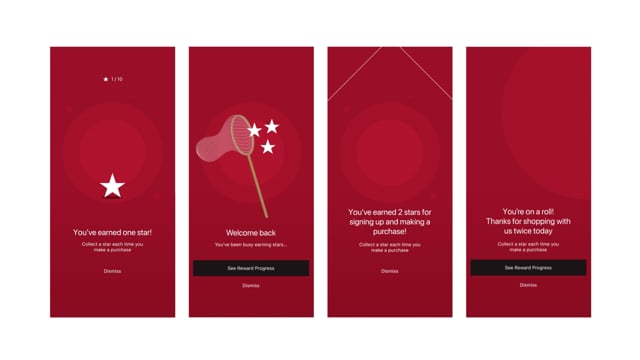
The reward element was a challenge, as this required a separate entity to illustrate the more generic concept of a 'reward', rather than illustrate the actual item the customer was going to receive. This limitation was due to stock management, store and geographic challenges, business changes and so on. By being a stand alone icon, the visual representation of a reward was also then able to be used consistently across the different channels.


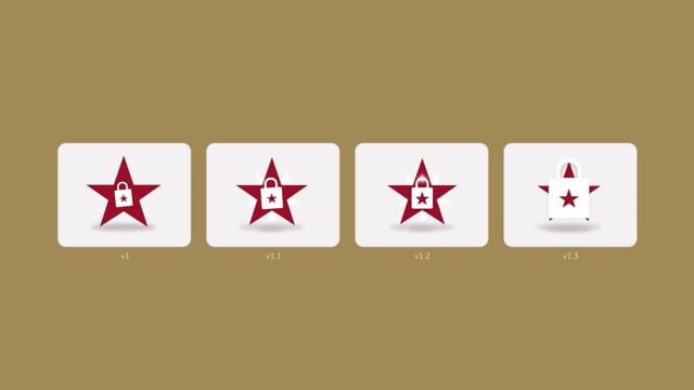
The icon began as a wrapped present or gift. This allowed us to find interesting ways to loop an animation, such as the present bursting open, or wanting to burst open, to create a sense of delight that Pret was seeking for they're customers. During retrospectives and post-testing debriefs however, this icon seemed slightly too generic to really play into the gamification they had wanted to get across. Tested users understood the proposition of getting to 10 stars and that the gift icon represented that product/reward, but something more was needed.


We then developed the idea of highlighting a reward through a Pret bag, which would appear once the user had reached 10 stars. Sitting on a plinth, a visual element used elsewhere in Pret's marketing, the 10 stars would fill one central star on the bag to highlight the journey the customer had been through to receive the reward. This too was well-received as an idea, but lacked a correlation between the 10 stars and a final icon.

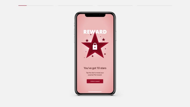
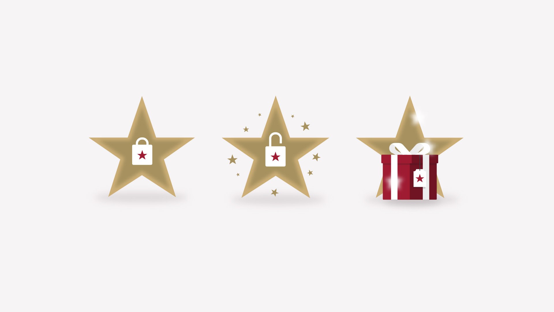
Using the bag element, we decided to use it as a centre point for the large red star that houses the progress tracker throughout the rest of the journey. When the user had reached 10 stars the bag would appear and would be 'unlocked' like a padlock, to highlight a perk had been unlocked. This tapped into the idea of gamification, breaking away from cliche static visuals and helped to bring some dynamism to the programme with the idea of something being hidden, only to be discovered once the user has reached 10 stars.


Iteration, Iteration, Iteration
Colour was a big challenge in the development of relevant iconography and animations. The team didn't want to define a specific 'Pret Perks' colour palette, instead aiming to utilise existing pastel colours during development and eventually landing on the idea of placing the animations on the neutral grey backgrounds. This allowed the animation to 'pop' from the component's surroundings, and also led to the decision to show the tracking progress journey through the red stars contained in the progress circle.
Further adjustments were also requested by Pret to utilise the 'semiotic' gold star, to demonstrate when the end goal had been reached and the unlocking of the perk.


Combined with the large gold star, the unlocking motif was added as a clear and defined way to show that something was hidden, awaiting the user to reach 10 stars and be incentivised to get the perk. This was another reason that the animation was developed iteratively; to best demonstrate a crescendo of activity. With the padlock jumping out of it's position as it unlocks, the 10 stars cascade out of the gold and accumulate into the centre, and this loops to continue to evoke delight for the customer.


Deliverables
Through additional animations for moments like loading screens, onboarding interstitials and other peripheral elements, our work created a new set of iconography and animations for the Pret A Manager proposition. This design system laid out the consistent way to show how Pret Perks works, and importantly creates the delight for customers that the team were aiming for, seeking a far more engaging proposition over many of Pret's competitors.